
Thanks to Stewart Mader I found this presentation on 25 Tips for a Better Wiki Deployment. As someone deeply interested in wikis and their use in business, I attempted to read through, but grew increasingly frustrated. Not because of the content, which is good, but the format. Why on earth have they (who?) delivered this in a presentation format?
All slides in this deck are divided in two half, one textual, the other graphical. Consequently they all show signs of the two cardinal sins of “committing” presentations.
1. – There’s way too much text. If you want me to read a story, you might as well type it up, use paragraphs, title fonts, bullet-points…etc, but don’t pretend it’s a presentation.
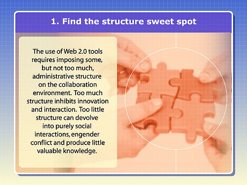
2. – Visuals are supposed to illustrate your point, capture my attention, shocking me, entertain me – whatever, just do something! This slide deck uses identical (rather boring, but that’s beyond the point) graphics on all 25 slides, which is just as good as no graphics at all.
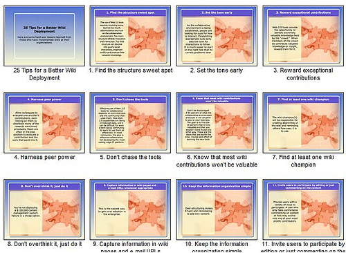
In summary, the textual half of each slide is way too busy, the graphical half is a missed opportunity: this is NOT a presentation.
What’s a good presentation like? Enjoy the winners of the World’s Best Presentation Contest on Slideshare (hat tip: Guy Kawasaki)

Recent Comments