post

Microsoft Should Donate PowerPoint to the Taliban

I don’t pretend to be a military strategist, but I’ve figured out how to win the war in Afghanistan.  OK, not on my own – The New York Times helped, with an article titled: We Have Met the Enemy and He Is PowerPoint:

Gen. Stanley A. McChrystal, the leader of American and NATO forces in Afghanistan, was shown a PowerPoint slide in Kabul last summer that was meant to portray the complexity of American military strategy, but looked more like a bowl of spaghetti.

“When we understand that slide, we’ll have won the war,” General McChrystal dryly remarked, one of his advisers recalled, as the room erupted in laughter.

Another choice quote:

“It’s dangerous because it can create the illusion of understanding and the illusion of control,” General McMaster said in a telephone interview afterward. “Some problems in the world are not bullet-izable.”

Wait, since when do Army Generals not like bullets? 🙂   But there’s more:

Last year when a military Web site, Company Command, asked an Army platoon leader in Iraq, Lt. Sam Nuxoll, how he spent most of his time, he responded, “Making PowerPoint slides.” When pressed, he said he was serious.

Platoon commanders spending most of their time fiddling with Powerpoint?  And we wonder why …. (slapped my hand, scrapped the rest of my comment…)

So here’s my 3-step Military Strategy, bulletized (could fit one PPT slide!):

  • Ban PowerPoint from the US Military
  • Convince Microsoft to donate 10,000 copies of PowerPoint to the Taliban
  • Go get them while they are busy PPT-ing 🙂

(Note: the above does not constitute a pro-war stance- I’m just having fun…)

Update: an old post of mine comes to mind:Romulan Attack Because of Microsoft Office

(Cross-posted @ CloudAve)

post

Mark Suster on Fox News: How to Present Your Business to a Crowd

My favorite quote: One of the worst things with Powerpoint is the bulletpoint…

(Cross-posted @ CloudAve )

post

Oh, That Bloated Presentation – The Web is Greener

We can argue all we want about  the benefits of SaaS, discuss hypothetical use cases at length, but the best showcases are served up by real life, often unexpectedly.

A startup CEO friend asked me to take a look at his PowerPoint deck before he would send it to a VC.  (Incidentally, I don’t believe presentations should be sent in advance of a meeting:  if your deck has enough content to convey the message standalone, than it’s not a  presentation… but let’s put that aside for now.)   I agreed to help, and he fired off an email with the PPT attachment.

Too bad I could not open it.  I have MS Office 2003 on my Windows computer – that’s the last version I purchased, since moving to the Cloud, and I won’t buy an Office package ever again – and he has Office 2008 on his shiny Macbook Air.  (Standard issue for hot startup CEO’s in San Francisco?). Yes, I know there’s a converter thingie I can download from MS, but apparently I haven’t done it on this particular computer, so my friend quickly saved it for me in the older format.

I reviewed and commented on it, and as an aside noted that the fonts and the text alignment were way off on a page.  He did not see the text problem on the version I sent back.  Then came a second round of conversions and emails.  It became apparent that no matter what we do we always end up seeing different layouts – so much for the MS to MS conversion – so we just focused on content, and I sent back the revised version.  It took a while… hm, no wonder, the PPT deck that started it’s life as a 2MB file first became 5, then 7, finally 9 Megabytes.  Wow!

What an inefficient process!  Emailing multiple bloated copies of the same file, never seeing the identical version, leaving quite some footprint behind, when we could have started with an online presentation, collaboratively work on the one and only copy online, see the same and not clutter several computers with the garbage files.

I will come back to this in a minute, but here’s another benefit my CEO friend missed out on: providing the latest and greatest information.  The VC Partner he was talking to was about to to go on vacation, and she was planning to review the presentation in the next 2 weeks – who knows when.  This startup was at the time in advanced discussion with major prospects, and signing any of those deals would materially change the presentation.  Had my friend sent just a URL to the online presentation, he could have safely update it any time, and be assured that whenever the VC reviews it, she will always have the latest and greatest information.  Does this scenario ( sans the VC) sound familiar?  How many times have you hit “send” only to wish you could retract the email and replace the attachment with the correct version?  

Back to the storage footprint issue. On my count, just between my friend and myself, we generated and stored nine copies of this presentation, the last one being 9MB, up from 2.  It’s probably fair to assume a similar rate of multiplication in the process the original deck was created, between the CEO and his team.  Next he sends it to the VC, who will likely share it with several Associates in the firm, and in case there’s more interest, with other partners.  Of course my friend will send the same presentation to a few other VC firms as well, so it’s not beyond reasonable to think that there are at least a hundred copies floating around, occupying a Gigabyte of storage or more.  Oh, and I did not even consider the footprint of this presentation at ISP’s and all hops it goes through.  Not that I ever bought into IDC’s Storage Paradox, but this is clearly a very wasteful process.

All of that could be replaced with one central copy on the Web, represented by a URL. 

Oh, and the irony of all this: my friend is CEO of a GreenTech startup. smile_wink

(Cross-posted from CloudAve.  Follow our CloudAve Feed for more)

post

Hate PowerPoint Because You Love Your Audience

Ok, I admit: it’s a bombastic title. Even worse, it’s stolen. I stole it from Entrepreneur – Startup CEO – Investor – Blogger Dharmesh Shah, who just explained why he hates Powerpoint, and we should, too. He points to Jeff Nolan’s post titled PowerPoint And The Spoken Word, which in turn links to Presentation Diva Laura “Pistachio” Fitton’s humorous piece, I don’t want them to be bored.

Client: “Should I have a PowerPoint?”

Pistachio: “Why?”

Client: “I don’t want them to be bored.”

Pistachio: “Then don’t.”

Pistachio: “Is there anything you need to tell them that you cannot do with your body or your voice?”

Client: “No.”

Pistachio: “There you go.”

Pistachio: “Uh, do you mind if I write this down for a blog post?”

The only reason the Presentation meme is not featured on TechMeme yet is that a good part of it is behind firewall, born at the SAP Marketing Community Virtual Meeting. So now I’m playing manual TechMeme, aggregating the conversation together here.

It all started by Laura giving practical advice on 10 Minutes to a Presentation that Rocks MUCH More. My favorite of her tips:

Lightning Round
Race through your presentation using no more than one sentence to explain each slide. Take no more than five seconds per slide. State the point in just one short remark. If you can’t, kill the slide. If you
can’t kill it, “maim” it until it has a point.

Then in Your Role-O-Deck (hm, I think I’ve just discovered another of her tricks, i.e. use killer titles) she speaks out against using “the deck”, a thick set of slides that are not used as visual aids by a live speaker, but as bastardized and poor replacement for MS Word, to write actual reports in SAP – in fact any large corporation.

My comment to her post is that the “ppt deck” is not only a corporate disease:

I’m involved with the startup community here, where the mentality is fresh thinking, “challenge all”, yet VC’s repeatedly ask startup Founders to send their “deck”. Deck is a nasty word, but describes what these bastardized “presentations” have become: thick and heavy.
My simple rule: if your deck is good enough to send in advance, i.e. it has enough content to convey the message, than you don’t have a presentation. Send the document, but develop another one you can use as visual aid to an actual live presentation.

Faheem Ahmed, VP of Portfolio Positioning and Messaging at SAP agrees in The myth of the “standalone” presentation:

Not all slides are presented. And there’s nothing wrong with using PPT to create useful diagrams or reports … it’s a tool just like any other. But then we shouldn’t call this set of slides a “presentation” any more. It’s a document.

He also talks against recycling presentations again and again, instead advises to define the strategic intent and develop specific ones.

So coming back to Dharmesh, does he really hate Powerpoint? No he doesn’t – not as a tool. He just hates “the deck”, and presentations that take over from the person who should be what we focus on. To illustrate his point, he shows us two examples, Mac vs. PC style:

Steve Jobs apparently wants the audience to listen to him tell the story, rather than read the slides:

Next comes a slide from Michael Dell. These are meant to be sent to someone who needs to get the full story looking at them, but when they are use as illustration to a live story, they become a distraction:

Dharmesh concludes:

If I had the talent and resources of Steve Jobs, I’d be able to create slides just fine. But I don’t (have the talent) and don’t have the resources) so I don’t like to create slides.

Hate PowerPoint because you love your audience.

I’m going to finish this with a quote from Jeff Nolan (hey, kids are always winners):

Powerpoint is like my 4 year old’s blanket, he can’t have his apple juice or go to sleep without it. Executives are afraid to not have Powerpoint, the big difference is that my 4 year old will eventually give up his blanket.

smile_wink

post

25 Tips for a Better Wiki Deployment + 1 Tip on How to NOT Use Presentations

Thanks to Stewart Mader I found this presentation on 25 Tips for a Better Wiki Deployment. As someone deeply interested in wikis and their use in business, I attempted to read through, but grew increasingly frustrated. Not because of the content, which is good, but the format. Why on earth have they (who?) delivered this in a presentation format?

All slides in this deck are divided in two half, one textual, the other graphical. Consequently they all show signs of the two cardinal sins of “committing” presentations.

1. – There’s way too much text. If you want me to read a story, you might as well type it up, use paragraphs, title fonts, bullet-points…etc, but don’t pretend it’s a presentation.

2. – Visuals are supposed to illustrate your point, capture my attention, shocking me, entertain me – whatever, just do something! This slide deck uses identical (rather boring, but that’s beyond the point) graphics on all 25 slides, which is just as good as no graphics at all.

In summary, the textual half of each slide is way too busy, the graphical half is a missed opportunity: this is NOT a presentation.

What’s a good presentation like? Enjoy the winners of the World’s Best Presentation Contest on Slideshare (hat tip: Guy Kawasaki)

post

The Wait is Over – Zoho Show 2.0 is the Real Deal

If there’s one application where the benefits of collaborative creation, sharing, easy access from anywhere speak for themselves, that’s presentations. After all, we rarely create presentations to ourselves: it’s a one-to-many, or more typically few-to-many situation. But dealing with version 
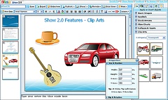
number 115 of the Sales Presentation, just figuring out which one is current, let alone contributing to it while someone else might be working on a different version is a nightmare – and when you’re ready to present, you’re still prone to accidents like this.smile_embaressed

However, until now, we did not have a truly powerful online Presentation tool. Today (actually, on the weekend) it all changes: Zoho Show 2.0 is a truly PowerPoint-class application to collaboratively create, edit, show and share online presentations.

The user interface has been completely revamped, and you can start building your presentation by picking one of the 50+ default themes. You’ll find extensive support for shapes, clip-art, flow-charting, bullets and numbering. Images can be easily manipulated, rotated, flipped around.

Most presentations don’t start from scratch though (you had to get to version #155 somehow..), so 
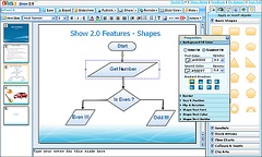
Zoho’s import facility is now significantly improved. I’ve tested it by importing several PPT decks that had suffered some deterioration in Show 1.0 – they come out perfectly in 2.0.

Show 2.0 now is a perfect online replacement for PowerPoint, except for transition effects, which are in the plans for Zoho. And that’s a comparison from a single user’s point of view. But again, presentations are rarely single-user projects… Zoho Show has built in Chat to facilitate work with your co-creators, and it also integrates Zoho Meeting, a full-blown conferencing, desktop-sharing application. Here’s Wired on the subject:

Given the slew of new features and slick interface, it makes more sense to compare Zoho to Powerpoint than other online competitors like Google. But even against desktop apps Zoho Show comes out a ahead in many areas — version control, sharing, online collaboration and ability to embed finished slideshows on your website are all features you won’t find in most desktop applications.

As they say, a picture is worth a thousand words, so I’ll stop talking – here’s a Show 2.0 presentation instead:

There’s also a video, which I am not embedding, as my blog often chokes while waiting for Viddler…you can easily watch it here though.

Finally, that remark above about the weekend: this is not a pre-announcement, Zoho Show 2.0 is ready, I’ve played with it. However, the servers will be updated this weekend, as there may be some downtime involved, and the Zoho team is trying to minimize the inconvenience. Show 2.0 is expected to be available late Sunday.

Read more on: TechCrunch, Read/WriteWeb, CenterNetworks , Mashable!, Between the Lines, Wired, Zoho Blogs

(Disclaimer: I am an Advisor to Zoho)

Update (12/15): The update appears to be done, if you log in to your Zoho account, you’ll see Show 2.0. (Remember, the update was expected later during the weekend, I’ve just accidentally discovered it now, which does not mean it’s really complete – the Zoho team might very well be still tuning it.)

There are some amazing slideshows in the Public presentations area, like this, this, this, this, this, this, this, this, this and this, just to pick a few.