My favorite quote: One of the worst things with Powerpoint is the bulletpoint…

(Cross-posted @ CloudAve )
Connecting the dots ...

My favorite quote: One of the worst things with Powerpoint is the bulletpoint…
(Cross-posted @ CloudAve )
I’ve said before: if you wanto to dazzle with your presentation, use Prezi. The Prezi team did to presentations what Google did to email: throw away all pre-existing notions, re-think why and how we use email (presentations) and build something from scratch. That’s how you get results that truly dazzle.
Of course that brings up the question of just how much you want to dazzle: probably not too much in the corporate world: as Prezi throws away all notions of what presentations are (used to be), there would be too much “undoing”, too steep a learning curve. PowerPoint and Enterprise are too deeply intertwined. That said Prezi is a great tool (online and offline) for superstar freelancers, small groups, or just about anyone who gets on stage and wants to … yes, dazzle.
But Prezi can make you dizzy 🙂 at least in the video below, played 10 times the original speed. So hold on to your chair tight, and enjoy…

(Cross-posted @ CloudAve )
 We can argue all we want about the benefits of SaaS, discuss hypothetical use cases at length, but the best showcases are served up by real life, often unexpectedly.
A startup CEO friend asked me to take a look at his PowerPoint deck before he would send it to a VC. (Incidentally, I don’t believe presentations should be sent in advance of a meeting: if your deck has enough content to convey the message standalone, than it’s not a presentation… but let’s put that aside for now.) I agreed to help, and he fired off an email with the PPT attachment.
Too bad I could not open it. I have MS Office 2003 on my Windows computer – that’s the last version I purchased, since moving to the Cloud, and I won’t buy an Office package ever again – and he has Office 2008 on his shiny Macbook Air. (Standard issue for hot startup CEO’s in San Francisco?). Yes, I know there’s a converter thingie I can download from MS, but apparently I haven’t done it on this particular computer, so my friend quickly saved it for me in the older format.
I reviewed and commented on it, and as an aside noted that the fonts and the text alignment were way off on a page. He did not see the text problem on the version I sent back. Then came a second round of conversions and emails. It became apparent that no matter what we do we always end up seeing different layouts – so much for the MS to MS conversion – so we just focused on content, and I sent back the revised version. It took a while… hm, no wonder, the PPT deck that started it’s life as a 2MB file first became 5, then 7, finally 9 Megabytes. Wow!
What an inefficient process! Emailing multiple bloated copies of the same file, never seeing the identical version, leaving quite some footprint behind, when we could have started with an online presentation, collaboratively work on the one and only copy online, see the same and not clutter several computers with the garbage files.
I will come back to this in a minute, but here’s another benefit my CEO friend missed out on: providing the latest and greatest information. The VC Partner he was talking to was about to to go on vacation, and she was planning to review the presentation in the next 2 weeks – who knows when. This startup was at the time in advanced discussion with major prospects, and signing any of those deals would materially change the presentation. Had my friend sent just a URL to the online presentation, he could have safely update it any time, and be assured that whenever the VC reviews it, she will always have the latest and greatest information. Does this scenario ( sans the VC) sound familiar? How many times have you hit “send” only to wish you could retract the email and replace the attachment with the correct version?
Back to the storage footprint issue. On my count, just between my friend and myself, we generated and stored nine copies of this presentation, the last one being 9MB, up from 2. It’s probably fair to assume a similar rate of multiplication in the process the original deck was created, between the CEO and his team. Next he sends it to the VC, who will likely share it with several Associates in the firm, and in case there’s more interest, with other partners. Of course my friend will send the same presentation to a few other VC firms as well, so it’s not beyond reasonable to think that there are at least a hundred copies floating around, occupying a Gigabyte of storage or more. Oh, and I did not even consider the footprint of this presentation at ISP’s and all hops it goes through. Not that I ever bought into IDC’s Storage Paradox, but this is clearly a very wasteful process.
All of that could be replaced with one central copy on the Web, represented by a URL.
Oh, and the irony of all this: my friend is CEO of a GreenTech startup. 
(Cross-posted from CloudAve. Follow our CloudAve Feed for more)
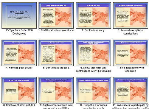
Thanks to Stewart Mader I found this presentation on 25 Tips for a Better Wiki Deployment. As someone deeply interested in wikis and their use in business, I attempted to read through, but grew increasingly frustrated. Not because of the content, which is good, but the format. Why on earth have they (who?) delivered this in a presentation format?
All slides in this deck are divided in two half, one textual, the other graphical. Consequently they all show signs of the two cardinal sins of “committing” presentations.
1. – There’s way too much text. If you want me to read a story, you might as well type it up, use paragraphs, title fonts, bullet-points…etc, but don’t pretend it’s a presentation.
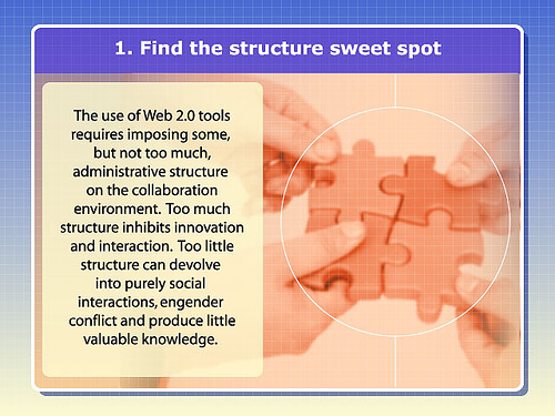
2. – Visuals are supposed to illustrate your point, capture my attention, shocking me, entertain me – whatever, just do something! This slide deck uses identical (rather boring, but that’s beyond the point) graphics on all 25 slides, which is just as good as no graphics at all.
In summary, the textual half of each slide is way too busy, the graphical half is a missed opportunity: this is NOT a presentation.
What’s a good presentation like? Enjoy the winners of the World’s Best Presentation Contest on Slideshare (hat tip: Guy Kawasaki)

Publisher / Editor of CloudAve and Enterprise Irregulars.
I do most of my business blogging there, with occasional asides here. More...
Recent Comments