post

Dilbert on Web Design – and more

Dilbert.com

Hm… I think I know which website they may be talking about:

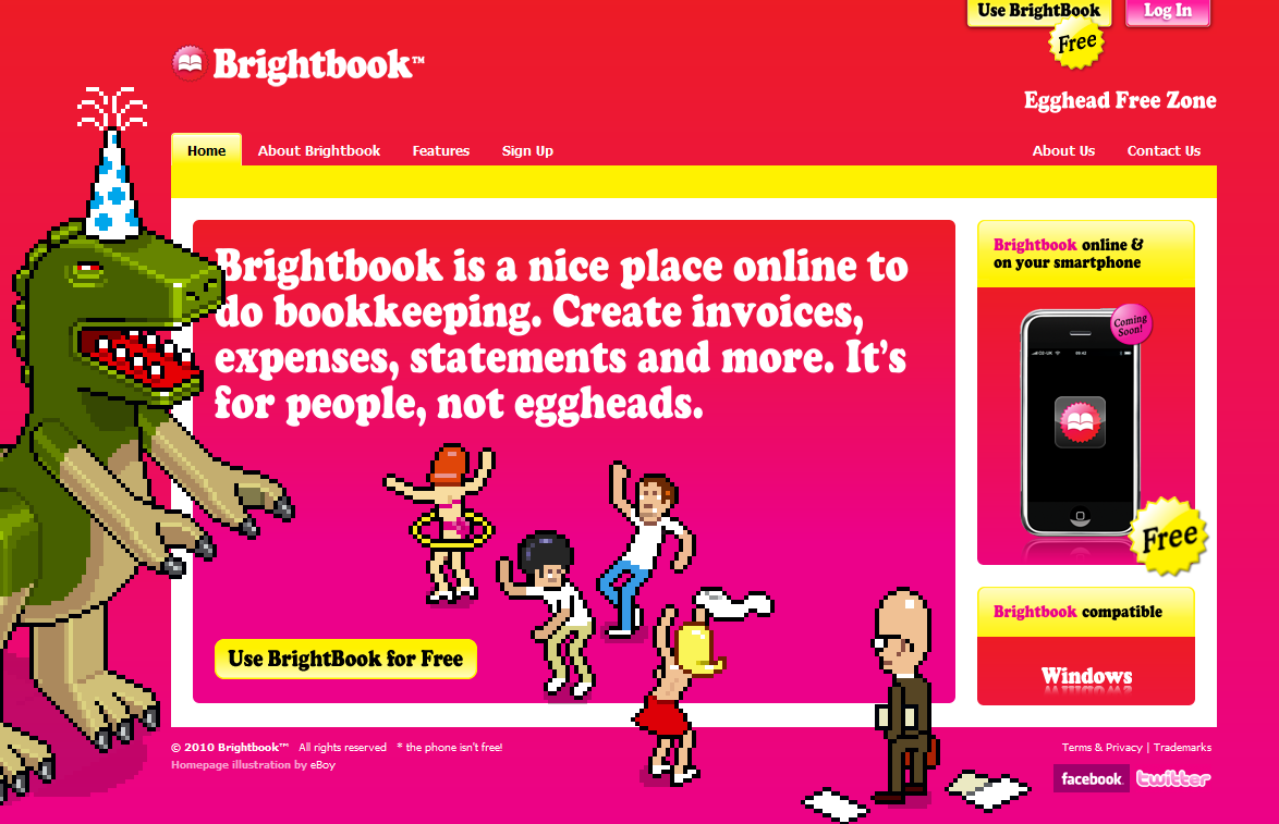
No kidding… yes, I know it’s April Fools Day, but this is real – an accounting SaaS provider , no less.  I once speculated on a brave new business model: Ugly Service taking commissions from the sunglasses industry… but this is beyond imagination.  Ziki, the company I wrote about back then came to their senses – wonder how long it will take for Brightbooks to become … hm.. less bright? 

(Cross-posted @ CloudAve )

post

Stupid Website Driving Customers Away

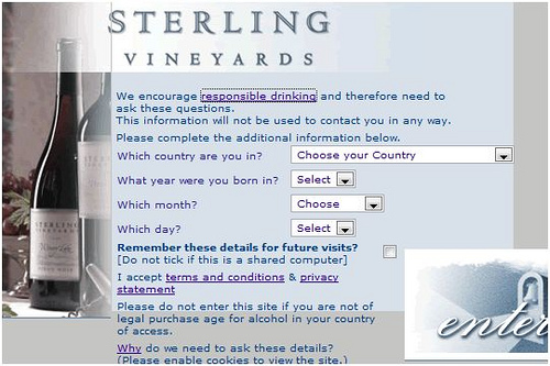
Sterling Vineyards is one of my favorite destinations in the Napa Valley, and it’s not about the wine.

It’s a pristine setting: interesting architecture nestled in the mountains, aerial tram ride to the top, beautiful views of the Napa Valley all make it a desirable tourist destination on its own. You can easily spend an entire lazy day there. Oh, yes, they make good wine, but it’s kind of secondary (well, to mesmile_tongue).

This being another gorgeous sunny weekend, visitors might want to check Sterling’s website for opening hours and other details. Of course the site promotes wines, but it’s not an e-commerce site, you can not order anything directly.

So why on earth do they feel the need to put up obstacles discouraging visitors from entering their website? You can’t enter without filling out the form below. What kind of bogus “protection” is this?

post

Google Takes a (404) Page from OpenDNS’s Book

Big brouhaha this morning over the fact that Google’s Toolbar “hijacks” 404 error pages and displays their own promo instead. “Google is evil” – say some webmasters.

I don’t see it a big deal. 404 pages are not exactly masterfully designed pages anyway, in fact I’m not really supposed to see them at all.

By the way, it’s not such a new idea either: it’s the very foundation of OpenDNS‘s business model.

Update: Google’s Matt Cutts explains how 404 works.

post

Bad Usability Calendar

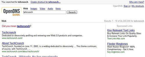
The 2008 edition of the (in)famous Bad Usability Calendar by is here.

The past three calendars have all been successful in distributing examples of bad design around the world. Check out the fresh examples of exaggerated use fancy of Web 2.0 design, cover flow, personalization, pull-down menus and more… 

Download the PDF here.

Courtesy of Norwegian design firm Netlife Research.