post

Courier & Foldable Tablets are Neither Innovative Nor “Different”

courier This is a sad “I’ve told you” moment, as I predicted the death of dual-screen tablets, be it the one by MSI or Microsoft’s Courier, which has just been canceled.  Says Frank Shaw, Microsoft’s VP of corporate communications:

At any given time, across any of our business groups, there are new ideas being investigated, tested, and incubated. It’s in Microsoft’s DNA to continually develop and incubate new technologies to foster productivity and creativity. The “Courier” project is an example of this type of effort and its technologies will be evaluated for use in future Microsoft offerings, but we have no plans to build such a device at this time.

Tech blogs are mourning the innovative, “different” device:

Courier was one of the most innovative concepts out of Redmond in quite some time.

I think dual-screen, foldable tablets are neither innovative nor different.  Well, different from other, truly innovative devices, like the iPad, but not different from good old books.  And therein lies the rub.  Hardware manufacturers rushing to the opportunity to follow Apple thought these tablets are mostly reading devices, so they imitated what we’re all used to: books.

Having two small pages side-by-side is not necessarily the ideal format for reading, it’s just the one we got stuck with for centuries when bound paper was the only way we could record / consume textual information. When we liberate information from paper, there’s no point in replicating the poor paper (book) experience. True innovation means embracing the paradigm-shift, rethinking the basics and maximizing readability, comfort, ability to interact as enabled by the new technology.

(Cross-posted @ CloudAve)

post

Dilbert on Web Design – and more

Dilbert.com

Hm… I think I know which website they may be talking about:

No kidding… yes, I know it’s April Fools Day, but this is real – an accounting SaaS provider , no less.  I once speculated on a brave new business model: Ugly Service taking commissions from the sunglasses industry… but this is beyond imagination.  Ziki, the company I wrote about back then came to their senses – wonder how long it will take for Brightbooks to become … hm.. less bright? 

(Cross-posted @ CloudAve )

post

SAP Video: Real-time Computing

Cool video by SAP, promoting the concept of in-memory computing.

If only their UI was as cute as their videos 🙂

Reblog this post [with Zemanta]

(Cross-posted @ CloudAve )

post

The Bogus Vista vs. Windows 7 Debate

If you love Windows XP, you’ll hate Windows 7 – says Ed Bott on ZDnet.  Windows 7: Mojave My Ass –complains Jason Perlow. Dwight Silverman confirms: Sorry, but Windows 7 isn’t a return to Windows XP, while others don’t refrain from some name-calling.

Sorry guys, you’re all wrong

You’re debating the merits of an operating system based on it’s UI.  Sure, if you migrate from XP to Win7, some of the changes can be confusing – but it’s an initial change, the learning curve is not that steep.  I actually side with Ed Bott here, the search box to launch programs is a more user-friendly approach than having to remember the names of all *.exe files a’la XP. 

But it does not really matter.  Mojave my ass?  Mojave was a bogus experiment (in fact a PR blitz dressed up as an experiment) showing happy “users” who liked the Vista UI – but hey had no chance to assess what fails in a short demo, and that’s what doomed Vista, not appearances.

Windows in all flavors, be it XP, Vista or 7 is not an application.  It’s a friggin’ operating system whose job is to get us into applications and get out of the way.  In today’s flurry of blog posts Adrian Kingsley-Hughes has the right approach, presenting performance tests – yes, performance is key to judging how good an operating system is.

The other key criteria is how invisible it stays. Think about it: any time you have to get down to OS level typically means something does not work right.  It’s the stupid unexplainable little things like:

  • Vista and XP computers not finding each other on a home network until you apply an undocumented patch to the XP machines
  • Simple copy or delete operations taking forever
  • Not being authorized to move / delete files on my own computer even after elevating to Admin mode, killing UAC and a number of weird cryptic options that take an IT deapartment to deal with, not a home user
  • Windows upgrade failing if more than 3GB memory is installed
  • The latest Windows upgrade causing printer and camera drivers from several vendors reinstall themselves (some take 30 minutes or more, kinda big deal)

The list could go on, but I think you get my drift:  Windows 7 (and any other OS) will be judged on how well computers will run, let users interact with real application without having to touch the OS itself.

Finally, to address the speculation about Windows 7 upgrade paths, let me just reiterate this:

  • Win7  should be released as  Vista Final (meaning it works)
  • It should be provided it as a free upgrade to Vista
  • It should come with a letter of apology to all Vista victims

OK, I know we have fat chances for the apology – but I really mean the free upgrade part.

(Cross-posted from CloudAve – to stay on top of Cloud Computing news, analysis and just our opinion, grab the CloudAve Feed here.)

post

When Captcha is Really, Really Bad

I confess: I also had a captcha on my blog, in my “prior life” on blogware. In fact my defenses were so developed (or primitive?) that Zvents CEO Ethan Stock rightfully called it an obstacle course.

Thankfully I have a better life (OK, just a platform) now, on WordPress, where the combination of Akismet and Spam Karma 2. provides sufficient enough spam protection so I don’t have to torture readers with such obstacle courses anymore. But I guess not all blog platforms are created equal.

Today I tried to leave a comment on Vinnie’s post, which is protected by a captcha. That would be OK (well, sort of) if only I knew it upfront. But what typically happens – and I am not picking on Vinnie, seen this on several other Typepad blogs – is that I review the comment, hit “post”, then move on to another Firefox tab (hey, even I can multitask). Later, when I come back to review the comment/close the tab, I find the captcha screen still waiting for my input. The damn thing was so slow, it did not reveal the captcha screen in when I was here before.smile_angry

How to improve the captcha? Well, displaying it right on the comment entry page would be a good start… but even better, remove it entirely, replace it with some more intelligent background process (like, if I am a repeat approved commenter on this blog, chances are I am not a spammer … but I am not trying to re-invent Spam Karma logic here).

The absolute irony of the situation: you can read it all right here, on Vinnie’s blog: UI again …don’t pretty up, destroy!

P.S. Vinnie, my friend, I am not picking on you … just your platform.smile_wink

Update (2/28): A hilarious collection of the 10 worst captchas.

Update (3/5):  CAPTCHA is Dead, Long Live CAPTCHA! @ Coding Horror.

post

Socialtext 2.0: Usability vs. Usefulness

Socialtext recently announced version 2.0 of it’s enterprise wiki. The two big news are a completely revamped user interface, aiming to make Socialtext a lot easier to use, and the publication of the REST APIs to support integration and mashup development. For more information watch this screencast by CEO Ross Mayfield, and see this review at TechCrunch.

The revamped UI is a huge deal, and it’s been long overdue. For some background check out Jeff Nolan on the “UI sucks” issue. One may agree or disagree, but as long as there are reviews like this:

I have tried on at least four separate occasions to use and like Socialtext but I can’t…I just can’t use this application.” – well, you definitely know you have a problem.

Interestingly enough Socialtext, the company realizes how important ease of use is, and they are contributing resources to bringing WYSIWYG Wikiwyg editing to Wikipedia. But let’s focus on Socialtext, the product for now.

The new UI is aesthetically pleasing, has nice colors (somewhat reminds me of JotSpot’s blue), but most importantly it’s clean, simple, in short it passes the “blink test“.

thumbs_up 
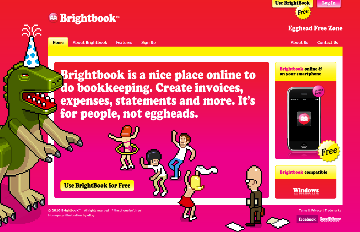
The Home Page is of key importance in the new release: a Dashboard gives users a quick glance of a shared whiteboard, personal notepad, customizable watchlist, a listing of what’s new (i.e. recently changed pages) as well as the users active workspaces (i.e. wikis). The Home page has become the central place where you can access all extended features, like a listing of all pages, files, tags, or change settings. You can start adding information using the New Page button, which, just like the Edit and Comment buttons on all subsequent pages clearly stands out, again, passing the “blink test”. I love the new colored side-boxes for tags, inbound links and attachments.

I can’t emphasize enough how important inbound links (backlinks in the previous releases) are – a wiki is all about associating pieces of information with each other, and the inbound link shows you where the information on the current page is used elsewhere. In wiki systems without this feature on would manually have to create them, a task most often forgotten (as it does not fit the natural flow of creating new pages), thus those systems don’t offer the full potential of a wiki. I can’t for the life of me understand why inbound links haven’t yet made it into the standard feature-set in JotSpot 2.0, when it’s been long (for more than a year) available as a downloadable plugin on the Jot Development wiki – but how many users search the development wiki? In contrast, Atlassian’s Confluence has long supported incoming links.

We know from Ross and others that in creating the new design the primary objective was to increase ease of use, and in doing so Socialtext conducted customer usability studies. The number one customer request was to reduce clutter, which was quite abundant in Socialtext 1.x. They certainly achieved this objective – perhaps too much. Playing around with the beta I run into trouble trying to create a page from an already existing page – I simply did not find the New Page button. “This is something too obvious to be a bug”, I thought, and Ross proved me right: It’s all part of “getting rid of the clutter” and doing what customers had requested.

Socialtext believes this helps eliminate a frequent problem: the existence of orphan pages in wikis. (Orphan pages are valid, existing pages that no inbound hyperlinks point to; thus it’s difficult to find them, other than by searching or listing all pages).

I am not sure binding users to the Home page is a good idea (it’s not just the “new page”button, all other extended features/tools are anchored here). To me the natural flow is typically top-down: one would create a subpage from the parent where the summary level thought flows, thus creating a parent-child relationship. In a business wiki, where after a while you’ll end up having a large number of pages, the further away you are from the right place (the parent), the more likely you will forget to create a link to the new page, thus may end up with a proliferation of orphan pages.

Interestingly enough, the most elegant solution to the orphan problem comes from two products at the opposite end of the spectrum: Wetpaint, the friendliest consumer/community focused wiki (actually a blend of wiki-forum-blog features) and Atlassian’s Confluence, the market-leading enterprise wiki. Other than the standard user-created links within the flow of text, these products also offer an automatic index of subpages along with each page. JotSpot‘s 2.0 release offers a less foolproof but reasonable solution: when you create a page by using the “new page” button, technically it becomes an orphan, however when you hit “save”, you’ll find yourself at the parent level where a quick alert pops up proposing to create a link to the child page you just set up.

There’s a fool-proof way of creating new pages that can’t become orphans: create a link before the page, and forget the “new page” button. While typing, wherever you want to branch out to a new page, insert a link to the page about to be created, typically by highlighting text and using the “link” icon, or in JotSpot you have the option of simply typing a WikiWord (also referred to as CamelCase), it becomes a link automatically. This “trick” creates a shell, essentially a placeholder for your new page: you can add content later, but since it’s already linked to, it can’t become orphan. All the wikis I’ve talked about allow this method, but Wetpaint and Confluence don’t really need it, since they provide navigation based on the auto-index of child pages. (Update [2/17/07]: I’ve just discivered a perfect existing term for what I am trying to epxlain here: LinkAsYouThink.)

Back to Socialtext, perhaps there is more to the new design than the desire to create a very simple, clutter-free user experience: the underlying philosophical difference between hierarchical structures, parent-child data relationship vs. everything being flat (created at the home page ) and only associated through links embedded in page text. But hierarchy, structure are not necessarily evil; only pre-existing ones are.

smile_wink We tend to think in structures, need organizing principles – there is a reason why books have a table of contents. Wikis, as unstructured as they are in “virgin state” are a good tool to create structure – our own one. The assumption of a parent-child relationship mimics our usual workflow, and it does not impose a rigid structure, since through through cross-linking we can still have alternate structures, no matter where we create a page.

Perhaps that’s the fundamental difference between Socialtext and the other wikis I’ve mentioned – which would explain why it doesn’t have breadcrumbs (navigational line at the top): this standard feature of all the other three products (Confluence, Wetpaint, Jot) does not really fit in Socialtext’s flat world.

My other issue about with Socialtext 2.0: I really would have expected to see document versioning by now: when you upload an attachment (typically doc, ppt or xls file), Jot and Confluence shows the current version, indicating the most recent version number and the user who changed the document last. Click for details, and you get all previous versions and details. Confluence even allows you to label every instance of the attachment with a comment. Socialtext simply lists all documents with the same title (or not), not recognizing them as version of the same file.

smile_sad

Finally, a minor gripe: it would be nice to see threaded commenting, like Wetpaint and Confluence does, allowing users to enter comments to a page itself or to a previous comment. Socialtext, just like Jot, only has a flat list of comments.

Summing up, the new Socialtext 2.0 Beta is really good-looking, but in my view limits functionality for (perceived) ease of use. That said, it’s a beta, and Ross conformed repeatedly that they are seriously evaluating test user comments and it’s possible that the final 2.0 release will have a better solution for the edit/navigation/orphan problem.

fingerscrossed

Last, but not least, let’s revisit document versioning. It’s very-very important. In my “prior life” where as corporate VP I introduced a wiki-based intranet to the company, we used it for document management first, before exploring more of the native wiki functions. But here’s the catch: document versioning in wikis solves a very old problem, but solves it on the bases on yesterday’s (OK, today’s ) technology. Even with proper versioning one has to download documents, locally update them, then upload them back up to the wiki. The process is a lot easier using Office 2.0 applications, be it an editor, spreadsheet or presentation. There is no uploading/downloading, all updates happen online, if need be by multiple users at the same time, and instead of attaching them, one would simply link to, say a Zoho Sheet or Presentation from the wiki.

My ‘dream setup’ for corporate collaboration: a wiki with an integrated Office 2.0 Suite. The next step will be the wiki integration with ‘traditional’ , transactional enterprise systems – that’s a little further away (although … reading this, who knows?

smile_wink ) I hope to discuss many of these concepts with my readers next week in San Francisco, at the Office 2.0 Conference.

Update (9/5): For more insight read Socialtext 2 Design.

Update (11/1): Usability review on InfoSpaces.